

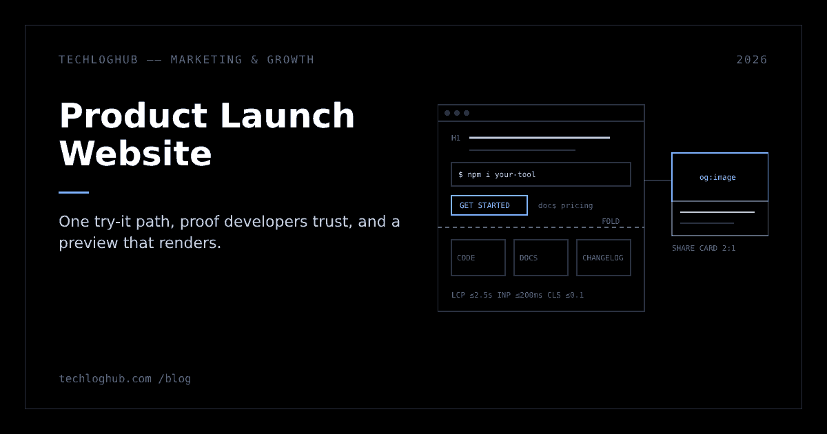
Product Launch Website: What a Dev Tool Launch Page Needs
Quick answer: A product launch website for a developer tool needs one clear path to a first working result: a plain headline, a code sample or screenshot, visible pricing and one primary button above the fold, then docs, a changelog and honest limits as proof. Add working Open Graph previews, keep the page within Core Web Vitals targets for the traffic spike, and remove any pre-launch noindex on the day.
A product launch website for a developer tool has one job: get a visitor from "what is this?" to a first working result in as few steps as possible. Everything on the page, from the headline to the share image, should either answer a developer's next question or get out of the way.
This is a checklist for the page your launch traffic will land on, whether that's a single landing page or a small site with docs and pricing. It's for founders who are building the product and the page in the same month. Rules and numbers are linked to their source; everything else is our advice.
Start with the try path, not the hero
Before you design anything, write down the shortest path from landing to "it works": an install command, a hosted sandbox, a public demo, or a signup that drops people straight into a working project. The page is wrapped around that path.
The big launch channels push you this way. Hacker News' Show HN guidelines say Show HN is for something you've made that other people can play with, ideally without signups or emails, and that landing pages, sign-up pages and minor version releases don't qualify. Product Hunt's sharing guide recommends a landing page with one call to action focused on getting people to use the product.
In practice that means one primary button, repeated down the page, and a secondary link to docs. A waitlist form is fine before launch; on launch day, replace it with access.
Pick the try path that fits your product
Each option has a different cost to build and a different failure mode under launch traffic. Our advice:
| Try path | Best for | Watch out for |
|---|---|---|
| Install command | CLIs, libraries, self-hosted tools | Pin a version that works, test on a clean machine, and show OS-specific variants in tabs |
| Hosted sandbox or playground | APIs, query languages, config formats | Abuse and cost spikes; rate-limit by IP and reset state regularly |
| Public read-only demo | Dashboards, admin tools, observability products | Demo data that looks fake; seed it with realistic records |
| Signup into a working template | SaaS that needs an account to be useful | Email verification walls; let people in first and verify later if you can |
| Interactive walkthrough | Products that need real infrastructure to run | It shows the product but isn't the product; pair it with a real way in |
Whichever you pick, time it. Ask someone who hasn't seen the product to go from the landing page to a first result while you watch without helping. Every point where they pause is a fix for the page or the product.
What goes above the fold
A developer decides in a few seconds whether to keep reading. The first screen should answer four questions without scrolling:
| Question | Answer with | Avoid |
|---|---|---|
| What is it? | A plain headline naming the category and the user: "Open-source feature flags for small teams" | Abstract slogans that could describe any product |
| How does it work? | A code snippet, a terminal command or a short product screenshot | Stock illustrations of people at laptops |
| What does it cost? | "Free and open source", "Free tier, then $X" or a link to pricing | Hiding price behind "Contact sales" for a self-serve tool |
| What do I do now? | One button: "Get started", "Try the demo" or the install command with a copy button | Three competing calls to action |
Use a single H1 that matches the headline, then a logical H2 per section. Our heading structure analyzer shows the outline search engines and screen readers will see.
Headlines and subheads that work for developers
Our advice is to write the headline as category plus audience, and let the subhead carry the differentiator and the proof. Compare:
| Vague | Specific |
|---|---|
| "Build without limits" | "Postgres branching for preview environments" |
| "The modern way to ship" | "Deploy Docker Compose apps to your own VPS with one command" |
| "Observability, reimagined" | "Open-source error tracking you can self-host in 10 minutes" |
Only promise a number like "10 minutes" if you've timed it on a clean machine. Developers will test the claim on launch day and say so in the comments.
The code block is part of the hero
For a library or CLI, the first code block often does more than the headline. Keep it short enough to read without scrolling inside the block, add a copy button, show the output under the command, and use the same example in the docs quickstart so people who click through see something familiar. If it needs an API key, say where to get one in the line above it.
Title and description for search and shares
The page title shows up in tabs, search results and some link previews. Google's title link guidance asks for descriptive, concise titles, distinct text on every page, and a short brand name at the beginning or end separated by a delimiter. It sets no length limit but truncates titles to fit the device width, so put the important words first.
For the meta description, Google's snippet guidance says snippets are primarily created from the page content itself, and the description is used when it gives a more accurate summary. It sets no length limit and warns that identical or similar descriptions on every page aren't helpful. Write a distinct one for the homepage, pricing, docs and launch post; the meta tag generator helps you draft them.
Proof that developers trust
Developers discount testimonials and logos they can't check. Give them things they can verify:
- Real code. A copy-pasteable example that runs as shown.
- Docs linked from the nav. A quickstart that reaches a first result in minutes, plus a reference section. Missing docs on launch day reads as "not ready".
- A public changelog. Dated entries show the product is maintained. You can mirror releases to the TechLogHub releases feed so each version gets its own page.
- Source and licence, if open. Link the repository and name the licence on the page; it's often the first thing people check.
- Honest limits. A short "what it doesn't do yet" section heads off the comment threads that would raise it anyway.
- Comparisons. If people will ask "how is this different from X?", answer on the page and keep it factual.
If the repository is part of the launch page
For open-source tools, many visitors will land on the GitHub repo instead of your site. Treat the README as a second landing page: the same headline, the same install command and a link back to the docs. Set the repo's social preview as well. GitHub's social preview docs ask for a PNG, JPG or GIF under 1 MB and recommend 1280x640 for the best display; until you add one, repo links show basic repository information and the owner's avatar.
Share previews: the page people see before your page
On launch day most people meet your site as a link preview in Slack, Discord, X or a community thread. A missing or broken preview makes a launch look unfinished.
The Open Graph protocol defines four required properties: og:title, og:type, og:image and og:url, with og:url acting as the canonical URL. It also recommends og:image:alt whenever you set an image. For X, the summary card with large image uses a 2:1 image between 300x157 and 4096x4096 pixels, under 5MB, in JPG, PNG, WEBP or GIF; SVG isn't supported.
Make one 1200x630 image (close to 2:1) per launch page that shows the product, not just the logo. Our OG image generator builds the image and the OG tag generator writes the tags.
If you're launching on Product Hunt too, its preparing for launch page asks for a square thumbnail (240x240 recommended, under 3MB) and at least two gallery images at 1270x760. Produce them from the same screenshots so the listing and site look like one product. Our Product Hunt launch guide covers the rest of that listing.
Preview QA before you announce
Our advice is to test the preview the way people will see it, not only in a validator:
- Paste the URL into a private Slack or Discord channel and a draft post on X and LinkedIn, and check the title, image crop and description in each.
- Use absolute URLs for
og:image, served over HTTPS, and make sure the image isn't blocked by authentication or robots rules. - Keep the important text in the middle of the image so square or narrower crops don't cut it off.
- If you change the image after sharing a link, expect some platforms to keep showing the cached version for a while; get it right before the first post.
Make it fast enough for a traffic spike
A launch sends more visitors in an hour than the page may see in a month, many on phones. Google's Core Web Vitals give concrete targets, measured at the 75th percentile of page loads: Largest Contentful Paint within 2.5 seconds, Interaction to Next Paint of 200 milliseconds or less, and Cumulative Layout Shift of 0.1 or less.
- Serve the landing page statically or from a CDN cache so a spike doesn't hit your app servers.
- Compress the hero image. Resize screenshots to the size they're shown at with the image resizer, and clean up inline icons with the SVG optimizer.
- Reserve space for media so screenshots and embeds don't push text around while loading.
- Check small screens. Code blocks overflow on phones; preview the page at common widths with the screen resolution tester.
- Load-test signup, not just the homepage. A fast landing page that leads to a failing signup is worse than a slow one.
Specific fixes for the hero screenshot
The hero screenshot is usually the Largest Contentful Paint element. web.dev's guide to the most effective Core Web Vitals fixes recommends putting the LCP image in the HTML as an <img> with src or srcset (not a JavaScript-loaded data-src), adding fetchpriority="high", and removing loading="lazy" from that image. It also recommends a CDN to cut time to first byte, explicit width and height attributes to prevent layout shift, and breaking up long JavaScript tasks, which it defines as tasks over 50 milliseconds.
Launch pages often pick up extra scripts in the last week: chat widgets, analytics, heatmaps, A/B testing. Our advice is to add only what you'll actually look at during launch week, and to load the rest after the page is interactive.
Readable for everyone
Dark themes and syntax-highlighted code are where launch pages most often fail on contrast. WCAG's contrast minimum at Level AA requires a ratio of at least 4.5:1 for normal text and 3:1 for large text, defined as at least 18 point, or 14 point bold. Check your code theme's comment colour and your muted grey body text against the background before launch.
SEO basics that matter on day one
Launch traffic fades in days; search traffic is what remains. Get the basics right before you announce:
- Unblock indexing at launch. If the pre-launch site was hidden, remove the
noindextag. Google's robots.txt guide says robots.txt is not a mechanism for keeping a page out of Google; usenoindexor password protection for staging, and check the live file with our robots.txt generator. - Publish a sitemap listing the homepage, pricing, docs and launch post, and submit it in Search Console. The sitemap XML generator builds one for small sites.
- Readable URLs.
/docs/quickstartbeats/page?id=12; the slug generator helps for blog and docs pages. - Keep the FAQ for people. An FAQ answering pricing, self-hosting and data questions still helps visitors, but don't expect a FAQ rich result: Google's FAQ structured data page says the feature no longer appears in Google Search as of May 2026.
- A favicon and touch icon so the tab and bookmarks look finished; the favicon generator outputs the usual sizes.
One canonical URL per page
Launch week creates duplicate URLs: tagged links from every channel, www and bare-domain versions, trailing slashes, and old staging hosts. Google's canonicalization guide lists redirects and rel="canonical" as strong signals and sitemaps as a weak one, says the methods can stack, and warns not to use robots.txt for canonicalization. Our advice: redirect the duplicates you control, put a self-referencing canonical on every page so tagged links point back to the clean URL, and list only canonical URLs in the sitemap.
Docs and pricing pages that hold up on launch day
Launch visitors who like the hero click one of two links: docs or pricing. Both need to be finished, even if they're short.
For docs, the Diátaxis framework names four forms that match four different needs: tutorials, how-to guides, technical reference and explanation. You don't need all four on day one. Our advice for a minimum launch set:
| Page | Diátaxis form | Launch-day minimum |
|---|---|---|
| Quickstart | Tutorial | Install to first result, every command copy-pasteable, with expected output |
| Common tasks | How-to guides | The three tasks people try right after the quickstart |
| Configuration and API reference | Reference | Every option or endpoint listed, even if descriptions are brief |
| How it works | Explanation | Architecture and trade-offs in one page; this is what technical commenters will quote |
For pricing, our advice is to state limits as numbers (seats, requests, projects), say what happens at the limit (blocked, throttled or billed), and say what's in the open-source edition if there is one. If you offer a launch discount, show the end date on the pricing page too, not only in the banner.
Launch-day versions of the page
The page that converts best on launch day is slightly different from the evergreen one. Plan the changes in advance and ship them as small, reversible edits:
- A launch banner linking to the announcement post or the live event, removed after a week.
- Channel-specific links. Use tagged links in your own posts and emails to see which channel sent activated users. Note that Product Hunt's listing URL can't be a shortened or tracking link such as a UTM, so link the clean URL there.
- A launch offer, if you have one, stated plainly with an end date.
- Status and support visible. A status page link and a way to report bugs. Visitors forgive bugs that are acknowledged quickly.
Product Hunt's sharing guide adds that your homepage can work as the launch page but often carries extra information and links that distract from launch goals, and points to Locofy and FlutterFlow as examples of dedicated launch landing pages. Its example launch offer is "20% off for 6 months".
Tag links consistently
Google Analytics' URL builder guide says to always use utm_source, utm_medium and utm_campaign, notes that missing parameters show up as "(not set)" in reports, and warns that values are case sensitive, recommending lowercase as standard practice. A simple convention we recommend, written down before launch:
| Channel | utm_source | utm_medium | utm_campaign |
|---|---|---|---|
| Your newsletter | newsletter | launch-2026-11 | |
| Your X post | x | social | launch-2026-11 |
| Your LinkedIn post | social | launch-2026-11 | |
| Community forum you're active in | forum-name | community | launch-2026-11 |
Leave the Product Hunt listing and the Show HN submission untagged and read those visits from the referrer instead. The canonical tag keeps the tagged versions from competing with the clean URL in search.
Measure whether the page did its job
Page views tell you the launch reached people; they don't tell you whether the page worked. Our advice is to define a short funnel before launch and read it daily for the first week:
| Metric | Definition | What a problem looks like |
|---|---|---|
| Try rate | Visitors who click the primary call to action or copy the install command, divided by visitors | Low rate: the headline or hero isn't answering "what is it?" |
| Signup completion | Signups completed divided by signups started | Drop-off at verification, password rules or a slow form |
| Time to first result | Median time from signup or install to the first working result | Long times: the quickstart has a gap the page promised away |
| Activation | Visitors who reach the first working result | The number to compare across channels |
| Docs exits | The docs page where launch visitors most often leave | Usually the step after a missing prerequisite |
Copying the install command can be tracked with a click event on the copy button; it's the closest a static page gets to measuring an install. Compare channels on activation, not visits.
The night-before check
- Click every link on the page, including footer, docs nav and pricing.
- Complete a signup and the quickstart on a phone and on a clean laptop.
- Confirm
noindexis gone, the sitemap is live and the canonical points to the production domain. - Paste the URL into Slack and X to check the preview.
- Check the status page, support address and error alerting.
- Diff the live copy against your final draft with the text diff checker so no placeholder text ships.
After launch, keep the site working as a long-term listing. Submit your product to TechLogHub so developers searching our product directory or the open-source directory find it, and link the page from your launch post so both keep earning visits. For the wider plan around the page, see our product launch strategy playbook and the product launch checklist.
FAQ
What should a product launch website include?
A plain headline naming the product category and user, one primary call to action that gets visitors to a working result, a code sample or screenshot, visible pricing, links to docs and a changelog, working share previews, and a short FAQ.
Do I need a full website or just a landing page to launch?
For most developer tools, one landing page plus docs and a pricing section is enough on launch day. What matters is that visitors can try the product. Hacker News treats landing pages and sign-up pages as off topic for Show HN, so link something people can use.
Should my homepage be the launch page?
It can be, but Product Hunt's sharing guide notes that homepages often carry extra information and links that distract from launch goals. A dedicated page focused on the product's key value and one call to action is usually the better landing spot for launch traffic.
What size should the social share image be?
Use an image close to 2:1, such as 1200x630. X's large summary card expects a 2:1 image between 300x157 and 4096x4096 pixels, under 5MB, in JPG, PNG, WEBP or GIF. Set og:title, og:type, og:image and og:url, plus og:image:alt.
How fast should a launch page load?
Aim for Google's Core Web Vitals targets at the 75th percentile: Largest Contentful Paint within 2.5 seconds, Interaction to Next Paint of 200 ms or less and Cumulative Layout Shift of 0.1 or less. Serve the page statically or from a CDN, and don't lazy-load the hero image.
Should I block my pre-launch site from Google with robots.txt?
No. Google says robots.txt isn't a mechanism for keeping pages out of its index. Use a noindex tag or password protection on the staging or pre-launch site, and remember to remove it before launch.
Wrap the page around the shortest path to a working result, and keep it useful after the spike.