

floating-vue — 💬 Easy tooltips, popovers, dropdown, menus... for Vue
A Detailed Guide to v-tooltip: Vue Tooltips, Popovers, and Dropdowns Built on Popper.js



Embedded Preview
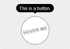
- Screenshot:
Overview
v-tooltip is a lightweight, flexible solution for adding tooltips, popovers, and dropdowns to Vue applications. It leverages Popper.js to position overlays reliably and predictably, even in complex layouts. The project, created by Guillaume Chau (aka Akryum), emphasizes simplicity and versatility, offering two primary usage patterns: a directive-based approach and a component-based approach. Whether you need a tiny tooltip on hover, a rich popover with interactive content, or a dropdown menu, v-tooltip provides a consistent API that works across Vue 2.x environments.
Getting Started
Two Ways to Use v-tooltip
- Directive: The v-tooltip directive attaches a tooltip-like overlay to a target element. It’s ideal for lightweight, declarative decorations, such as small hints or contextual help.
- Component: The v-popover component allows you to embed Vue templates inside the overlay. This is perfect for richer content, forms, or interactive panels that behave like a small, self-contained component.
A quick path to a working setup looks like this:
- Install the plugin with npm.
- Register the plugin in your Vue app.
- Apply v-tooltip to elements you want to annotate or attach a popover to.
- If you need a popover or dropdown, use the v-popover component and customize it to your needs.
The visual language of the library is designed to be unobtrusive by default, while also offering extensive customization so you can craft precise, themed overlays that match your app’s style.
Installation
NPM Setup
- Install the package:
- npm install --save v-tooltip
- Register the plugin globally in your Vue app:
- import Vue from 'vue'
- import VTooltip from 'v-tooltip'
- Vue.use(VTooltip)
Alternative usage without a global install
- You can opt to use the directive and component directly:
- import Vue from 'vue'
- import { VTooltip, VPopover, VClosePopover } from 'v-tooltip'
- Vue.directive('tooltip', VTooltip)
- Vue.directive('close-popover', VClosePopover)
- Vue.component('v-popover', VPopover)
Browser usage (no build step)
Include the distributed script in your page:
If Vue is detected on the page, the plugin is installed automatically. If not, you can manually install it:
Vue.use(VTooltip)
Or register directives and components directly:
Vue.directive('tooltip', VTooltip.VTooltip)
Vue.directive('close-popover', VTooltip.VClosePopover)
Vue.component('v-popover', VTooltip.VPopover)
Style and Theming
- After installation, you typically add your own styles. The library includes a powerful set of defaults but is designed to be styled to fit your project.
Usage
Directive Style and Basic Usage
- The v-tooltip directive is bound to a target element. You can provide content directly as a string or tie the content to a reactive property.
- HTML content is enabled by default inside tooltips. If your content is user-provided, you should consider disabling HTML parsing for security:
- When enabling HTML globally is disabled, you can still opt into HTML on a per-tooltip basis by specifying html: true in the tooltip options.
- Tooltip positions are flexible. They can be placed in a wide variety of directions and alignments.
Object Notation
- Instead of a simple string, you can pass an object to customize the tooltip’s behavior. This opens up a wide range of properties, including content, classes, and triggers, among others.
Dynamic CSS Classes
- You can dynamically toggle CSS classes on the tooltip using an object or reactive properties. This helps you apply different themes or behaviors without rewriting markup.
Other Options
v-tooltip supports a comprehensive set of options to control behavior and appearance:
- content: The content to display inside the tooltip. It can be HTML, plain text, a function returning content, or a Promise (for asynchronous loading).
- classes: CSS classes for the tooltip element, adjustable over time or via data.
- targetClasses: Classes added to the target element.
- html: Whether to allow HTML content. Be mindful of security when showing user-generated content.
- delay: Show/hide delay, or a pair of delays for show and hide, in milliseconds.
- placement: Where the tooltip should appear (top, bottom, left, right, and their auto variants).
- trigger: Which events trigger the tooltip. You can combine events like hover, click, and focus, or use manual mode for complete control.
- show: Manually control the visibility with a boolean.
- offset: Pixel offset for fine-tuning the overlay’s position.
- container: The container element to which the tooltip is appended (e.g., 'body'). Set to false to attach to the target’s parent node.
- boundariesElement: The element used to constrain overlay boundaries.
- template: Custom HTML template for the tooltip.
- arrowSelector, innerSelector: Selectors to locate the arrow and inner content within the tooltip’s template.
- autoHide: Automatically close the tooltip on certain interactions (e.g., mouseover).
- hideOnTargetClick: Auto-close when the target is clicked.
- loadingClass, loadingContent: Styles and content visible when content is loading.
- popperOptions: Any additional Popper.js options to fine-tune positioning.
Async Content Example
- The content option supports promises, enabling loading states or dynamic content from asynchronous sources.
Manual Trigger Example
- Trigger behavior can be fine-tuned to create a button that opens a tooltip on demand.
Tooltip Auto-Hiding
- By default, if the trigger contains hover, the tooltip hides on hover out or after a click. You can disable this with the autoHide option, giving you precise control over user interaction.
Disabling Tooltips
- On mobile devices, tooltips can be globally disabled to avoid clutter. The VTooltip.enabled property provides a straightforward way to enable or disable tooltips based on viewport width.
Component: v-popover
If your use case requires rendering Vue components inside the overlay, the v-popover component is the way to go:
- Basic usage: A simple clickable element can reveal a popover with rich content.
- Styling integration: The default classes include tooltip and popover, which makes it simple to override the look and feel with your own CSS or preprocessor styles.
- Arrow management: The arrow element is important for visual cue and must be included in your template. Don’t forget to set its z-index so it appears above other content.
- Theme and structure: Use popoverClass for theming, and define base, wrapper, inner, and arrow classes to customize every part of the overlay.
Popover Component Reference
Key props you’ll commonly use:
- open: Controls visibility of the popover.
- disabled: Disables interaction; if it’s open, it will close.
- placement: Positioning (top, bottom, left, right, and their variants).
- delay: Delay before showing or hiding.
- trigger: Events that show the popover (hover, click, focus), or manual mode.
- offset, container, boundariesElement, popperOptions: Positioning and containment controls.
- popoverClass, popoverBaseClass, popoverWrapperClass, popoverArrowClass, popoverInnerClass: CSS classes for theming and structure.
- autoHide: Hide automatically when clicking outside.
- handleResize: Automatically update position when content size changes.
- openGroup and openClass: Grouping logic to coordinate multiple popovers.
Events you may rely on:
- update:open(Boolean): Enables v-model style syncing with .sync on the open prop.
- show/hide/apply-show/apply-hide: Emitted around visibility changes with the configured delays.
- dispose and close-directive: Lifecycle hooks for cleanup or directive-driven closures.
- close-group: Emitted when another popover in a different open-group closes yours.
- resize: Emitted when content size changes (requires handleResize to be true).
Close Directive
Inside a popover, you can attach a v-close-popover directive to close it when an element is activated (clicked or touched). This is ideal for close buttons or actions that should dismiss the overlay.
- You can enable or disable the directive globally or per-element.
- The directive can be bound to a property to reactively control closing.
Global Options
v-tooltip ships with a thoughtful set of global defaults that define the baseline behavior and styling for both tooltips and popovers. You can override these values during installation or at runtime for a more customized experience.
Global defaults include:
- defaultPlacement: The default position relative to the target element (e.g., top).
- defaultClass: The default CSS classes applied to the tooltip element.
- defaultTargetClass: The default CSS classes applied to the target element (the element that triggers the overlay).
- defaultHtml: Whether HTML is allowed in tooltip content by default.
- defaultTemplate: The default HTML template of the tooltip (if you supply your own).
- defaultArrowSelector and defaultInnerSelector: Selectors for locating the arrow and inner content within your template.
- defaultDelay: The default show/hide delay.
- defaultTrigger: The default events that trigger the tooltip (e.g., hover and focus).
- defaultOffset: The default offset in pixels.
- defaultContainer: The default container for appended tooltips (usually the body).
- defaultBoundariesElement and defaultPopperOptions: Boundary constraints and Popper.js options.
- defaultLoadingClass and defaultLoadingContent: Styling and content used while content is loading.
- defaultAutoHide and defaultHideOnTargetClick: Behavior around automatic hiding and closing when the target is clicked.
- disposeTimeout: How long to wait before destroying tooltip DOM nodes after closing.
Popover defaults are nested under a popover property, allowing separate defaults for popovers (placement, classes, delays, triggers, etc.).
Style Examples
The library ships with extensive styling examples and guidelines to help you create a consistent, attractive UI:
- Sass/Less examples demonstrate how to theme tooltips and popovers, including arrow coloration, inner panel styling, and shadowing.
- CSS examples provide practical rules to ensure overlays behave well with your layout, including placement-based styling for the arrow, inner panel, and popover wrappers.
- Tips emphasize keeping the arrow on a higher z-index to ensure the overlay sits visually on top of surrounding content.
Style customization notes include:
- The shape and color of the tooltip interior (tooltip-inner) and the arrow (tooltip-arrow) are easily themed with classic rules or preprocessor variables.
- When using a popover you’ll often style the inner content (popover-inner) and the arrow (popover-arrow) to match your theme.
- It’s common to adjust the z-index to ensure the arrow does not get buried behind other content.
Compatibility and Accessibility
- The v-tooltip suite is designed for Vue 2.x ecosystems, leveraging Popper.js for robust positioning across viewport changes and scrolling contexts.
- The library provides a range of options to tune accessibility, including sensible focus management and keyboard interaction in typical configurations. When enabling HTML content, it’s wise to consider accessibility concerns and ensure content remains readable and navigable.
Live Demos and Documentation
- The project provides a detailed set of documentation pages and live demonstrations to illustrate usage, modifiers, and advanced configurations.
- Quick links in the project’s repository offer navigation to a live demo, documentation, and JSFiddle examples to experiment with behavior before integrating into a real application.
Styling and Theming: Practical Tips
- When building an interface with themed overlays, consider creating a dedicated class that governs tooltip color, typography, and border radii. By applying that class to the default tooltip class (defaultClass), you can switch themes globally.
- If your design uses a consistent card or panel motif (rounded corners, shadows, and a particular padding), translate those rules into the tooltip’s inner panel (tooltip-inner or popover-inner).
- Don’t forget the arrow’s visual integration. The arrow should reflect the main panel’s color and border radius to maintain visual continuity. The examples show how to color the arrow consistently with the inner panel.
- For complex overlays or nested layouts, use container and boundaries settings to keep overlays within the viewport and avoid clipping or overflow issues.
Common Scenarios
- Small informational hint: A light tooltip with brief content, shown on hover or focus, with a top or bottom placement.
- Rich popover: A panel containing input fields, buttons, or other Vue components, opened via click and styled with a custom popover theme.
- Dropdown-style overlay: A menu or list that appears under a button and remains anchored to the trigger regardless of page scroll.
Limitations and Considerations
- While HTML content is powerful, it also introduces security considerations. If content originates from user input, consider turning off default HTML parsing and explicitly enabling it only for trusted content sources.
- On mobile devices, tooltips may feel intrusive if not configured carefully. The library’s responsive options and the ability to disable tooltips on smaller screens are helpful mitigations.
Examples and Quick References
- Basic directive usage:
- Apply v-tooltip to an element and provide content, with optional reactive bindings.
- Object-based configurations:
- Pass an object with content, placement, trigger, and delay to customize the overlay per instance.
- Async content:
- Use a function or promise as content to illustrate loading states or dynamic content retrieval.
- Manual control:
- Use trigger: 'manual' and show to explicitly manage visibility via code for highly controlled interactions.
Close with Confidence
v-tooltip combines ease of use with deep configurability. If your app requires quick tooltips or full-featured popovers with Vue integration, v-tooltip offers a practical, well-documented approach that scales from simple hints to comprehensive overlay experiences. With a clear API for directives and components, plus a robust set of global options and style hooks, you can tailor every overlay to your design system while preserving accessibility and performance.
License
MIT License — Created by Guillaume CHAU (AKRYUM). This permissive license makes it suitable for both personal projects and enterprise applications, allowing you to adapt, extend, and distribute with minimal friction.
In Closing
The v-tooltip project is a thoughtful toolkit for Vue developers who want reliable, polished overlays. The combination of straightforward directives and a flexible popover component enables you to cover a wide range of user interface patterns—from tiny hints to fully fledged interactive panels. The inclusion of a mature global option set means you can apply consistent behavior across your application, while the styling examples and theme-ready defaults help you align visuals with your brand. If you’re building a Vue 2.x app and require dependable, well-documented tooltips, popovers, or dropdowns, v-tooltip is worth exploring.
Enjoying this project?
Discover more amazing open-source projects on TechLogHub. We curate the best developer tools and projects.
Repository:https://github.com/Akryum/floating-vue
GitHub - Akryum/floating-vue: floating-vue — 💬 Easy tooltips, popovers, dropdown, menus... for Vue
💬 Easy tooltips, popovers, dropdown, menus... for Vue...
github - akryum/floating-vue